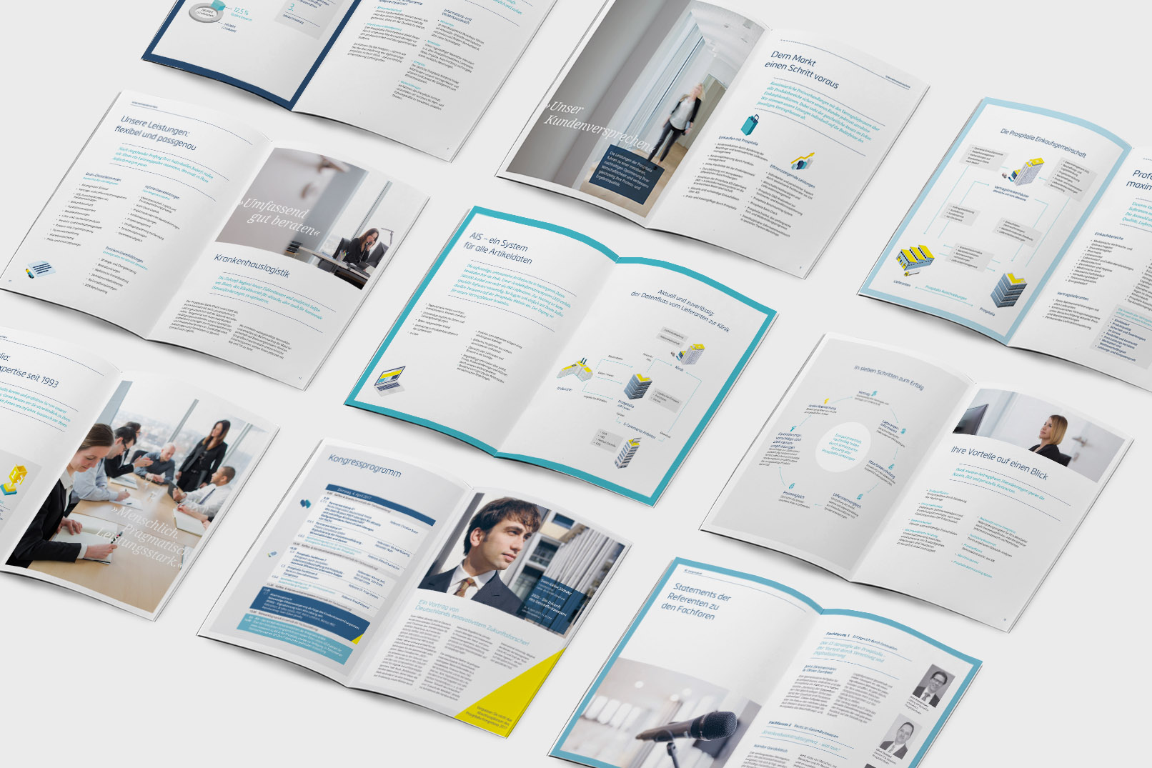
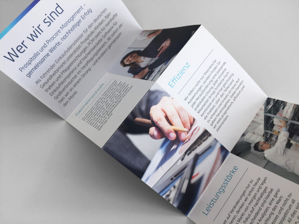
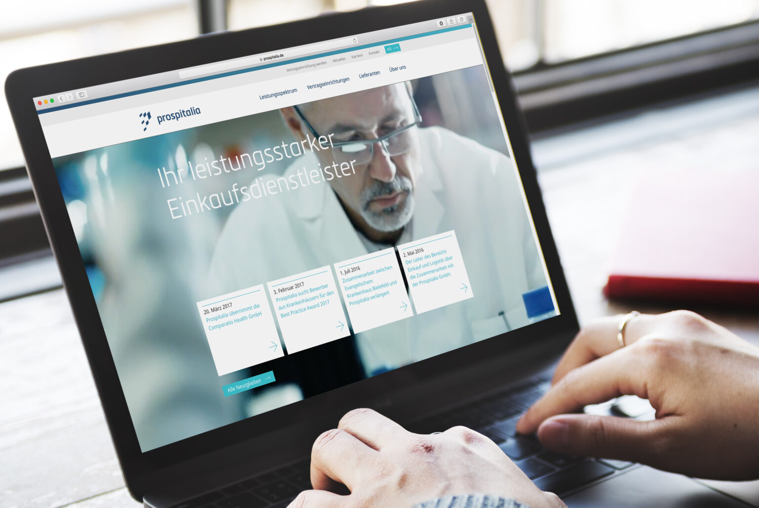
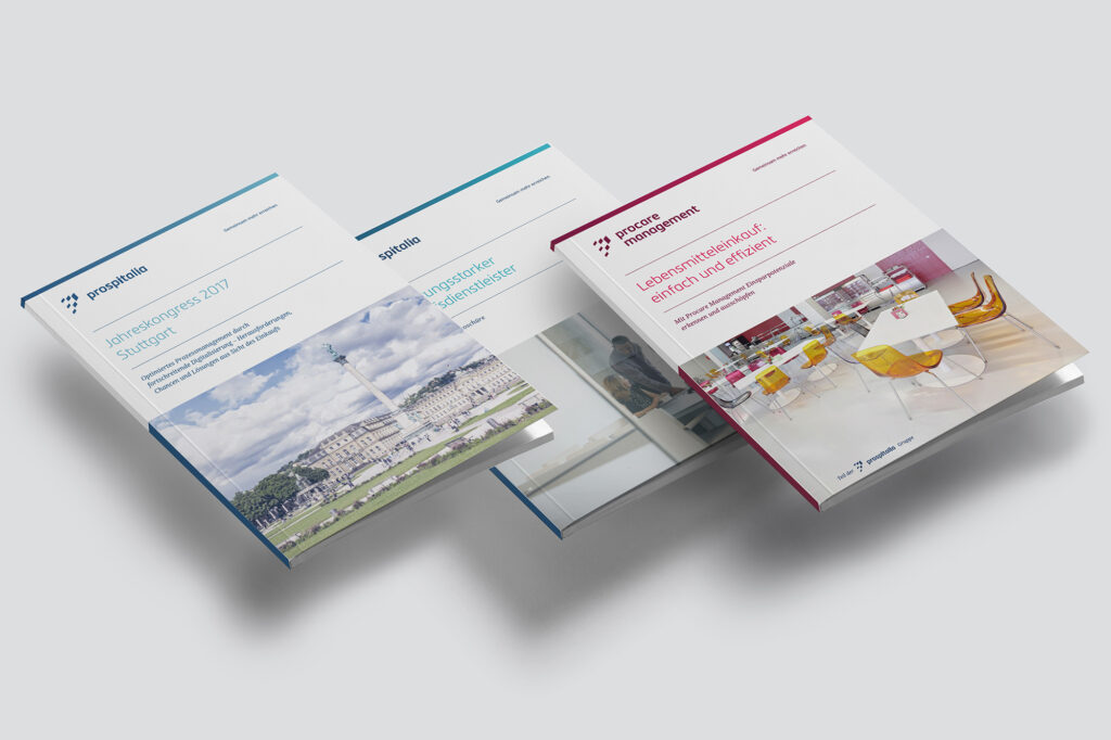
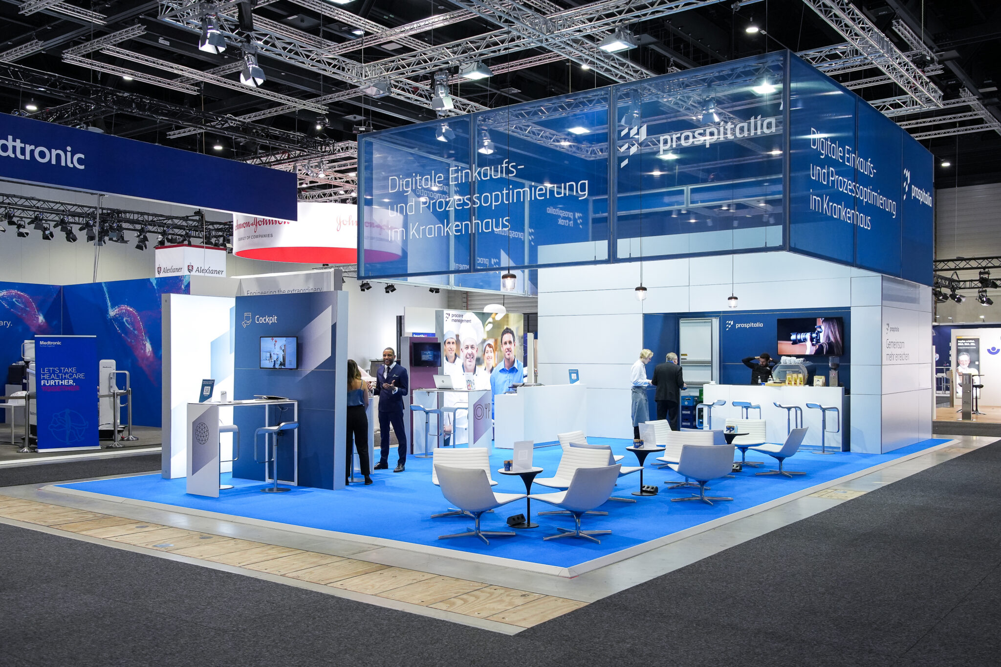
The company positioning – developed in cooperation with our client – outlined Prospitalia as a pragmatic and powerful service provider whose core strengths lie in the team and close customer relationships. The new logo represents the basic idea of clients being stronger within the purchasing community than on their own. This principle, summarized in the claim “Achieving more together”, is also emphasized and lived by Prospitalia’s workforce. In the course of the revised brand architecture, the subsidiaries Procare Management and Prospitalia Comparatio were integrated into the design system to visualize the the joint strength of the company network. The brand rollout took place during the Prospitalia Congress 2017 in front of more than 600 clients and suppliers and was supported by the launch of the new website and a wide range of marketing material and advertising gifts.
See more: www.prospitalia.de